My Role: UX Designer
My Contribution: UX Research, User Interviews, Site mapping, Wire-framing, Rapid Prototyping, High Fidelity Design & Logo design
Timeline: 3 weeks
Background
NYC residents are directly affected by government decisions. However, it is very difficult and confusing for people to understand what decisions are being made. This makes residents feel as though they have no say in the decisions being made. New York City has tried to bring residents closer to the action by having a Participatory Budgeting Project, which allows local residents to vote and make informed decision on how this allotted budget will be spent within their community.
The Task
Design a better experience for NYC residents who want or need to access information about their local government.
Problem Statement
New Yorkers needs a direct way to voice their informed opinion on local budget spending in order to harness their power as a stakeholder and improve current conditions in their community.
The Research
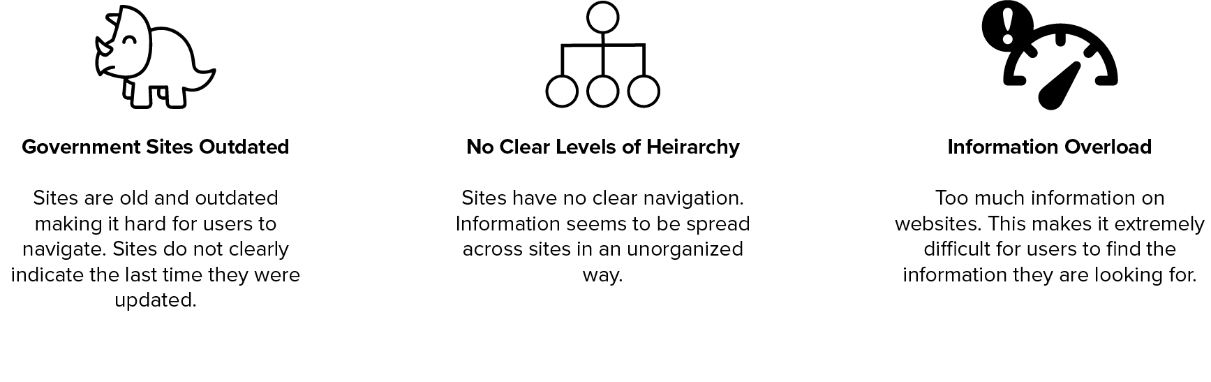
After conducting domain research & a competitive analysis, we found:
Insights
● Lack of accessibility to budget information: Budget information was hard to find and was not presented in a clear format friendly for users.
● Too many sites to navigate in order to find information: Information was hard to find and one site would lead you to another and so on.
SME Interviews
Who did we interview?
• IBO Budget & Policy Analyst
• Federal Agent
• NYPD Police Lieutenant
• Journalist at Patch
• NYC Comptroller’s Office Auditor
User Interviews
Who did we interview?
• Accountant
• Employee at Non profit
• Financial analyst
• Small business owner
Insights
What did we takeaway from our interviews?
● Lack of Awareness: People don’t know they have a say in local government laws and budget allocation. They’re passive or disinterested.
● Scattered Information: Big pain point- Information is there, but they don’t know where to look or cannot find the answer easily. Information is not readily accessible.
● Not Citizen Friendly: Public feels as if these sites are not made for them. They can’t understand the information and even if they see it, they don’t know how it impacts them.
● Budget: People are wondering how their tax dollars are being spent.
● Government Misperception: Most users and even government workers have a negative outlook towards the government.
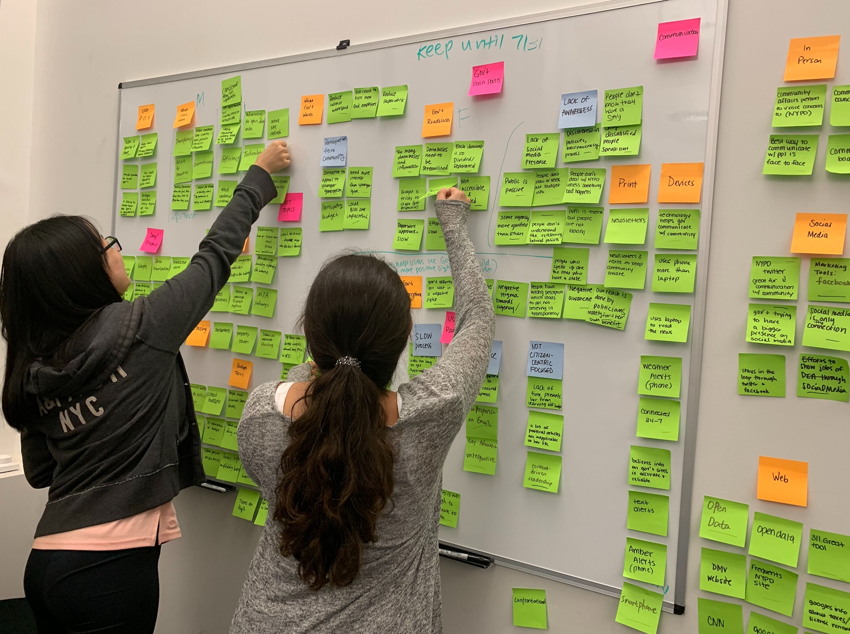
Working on affinity mapping our interview results and insights
Persona & Journey Map
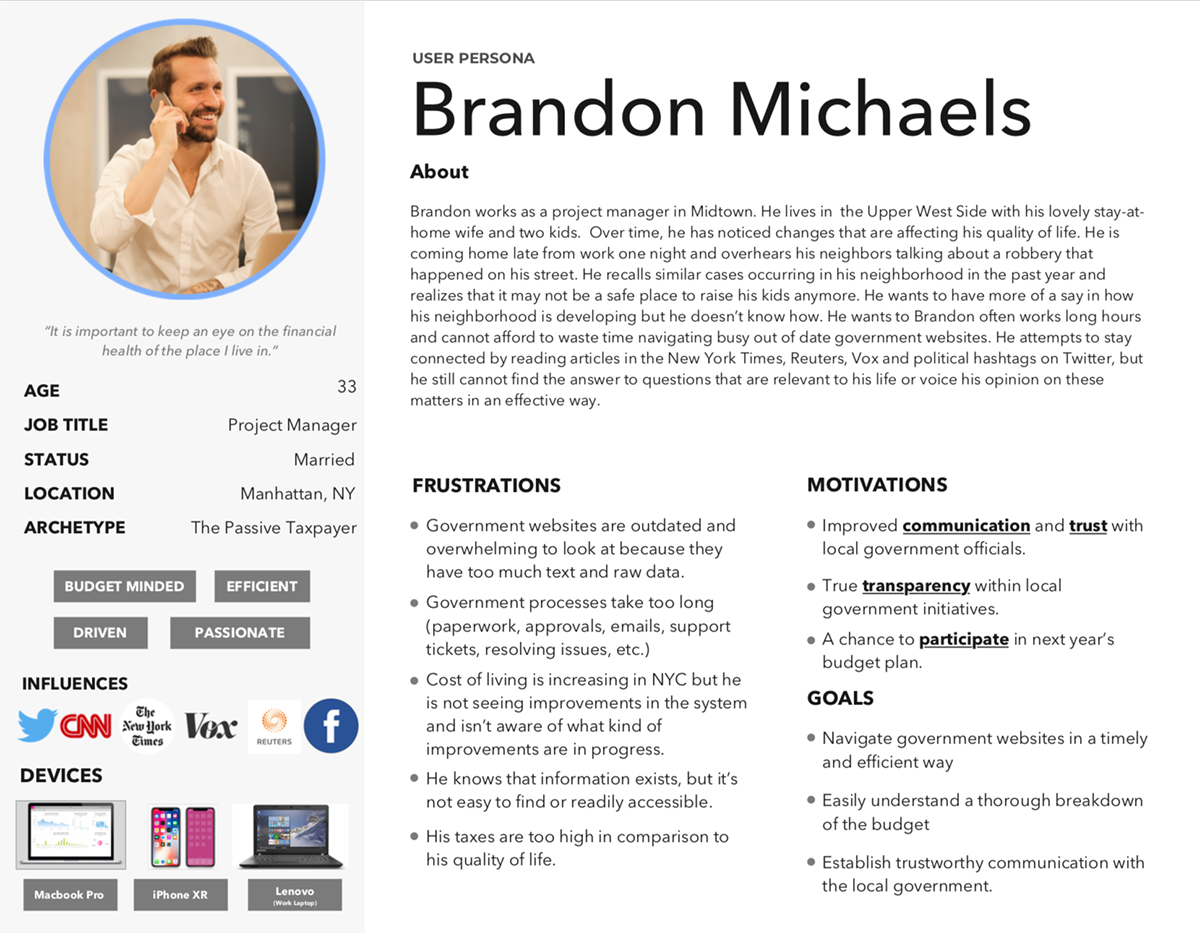
Who is our persona?
We created a persona that embodies our user based on our interviews and research. Brandon Michaels is a New Yorker who gets frustrated with not knowing where his tax dollars are going. He wants to have a say in the budget but doesn't know where to start. The outdated websites and unfriendly language turns him off and he gives up.
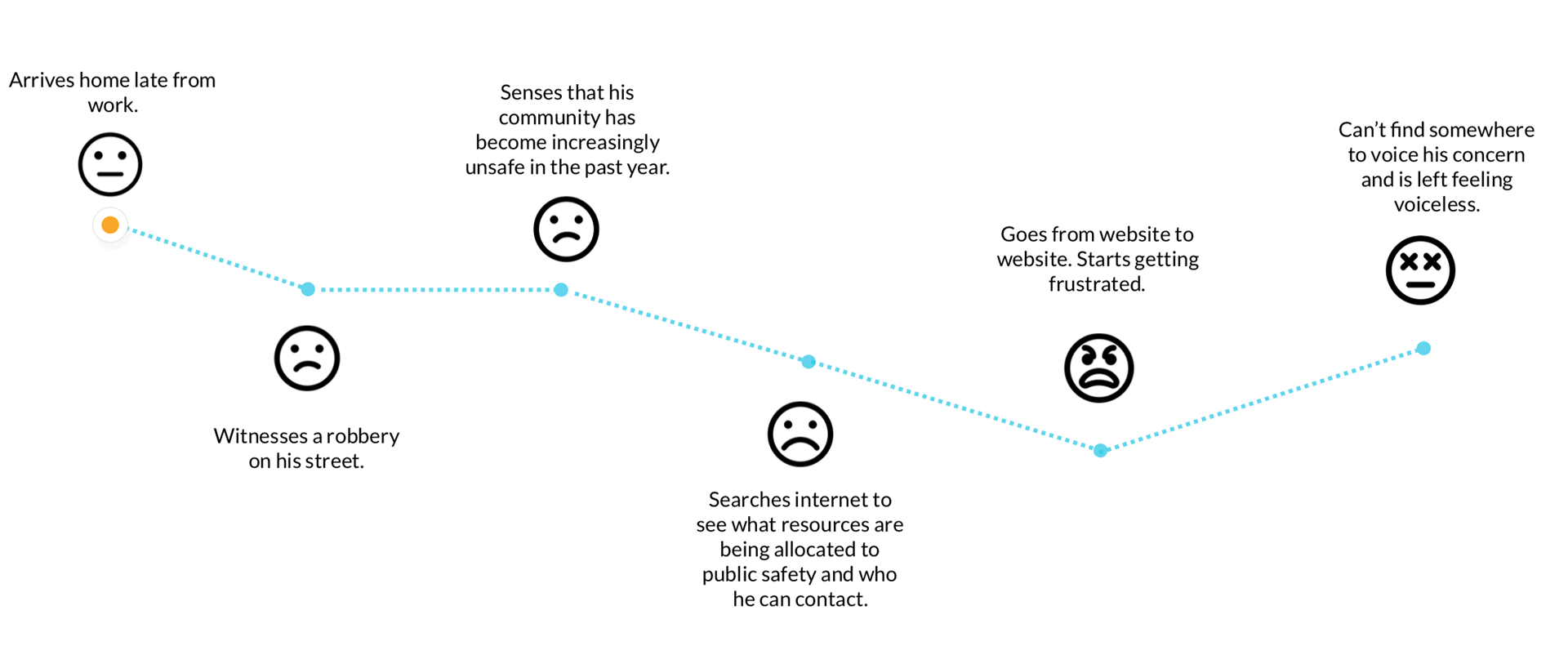
What about his journey?
Brandon works a full time job and sometimes will work late. He gets home late and witnesses a robbery on his street and starts to realize there has been an increase in crime in his neighborhood. He gets on his laptop and starts googling to see if he can see what resources and budget are being allocated to public safety and who he can contact. The site is outdated and keeps sending him in circles. He ends up closing the laptop due to being frustrated and feeling it's useless.
Ideation Phase
When beginning our ideation phase we time boxed ourselves to create some quick sketches. After discussing we ended up with 4 concepts and received feedback from users.
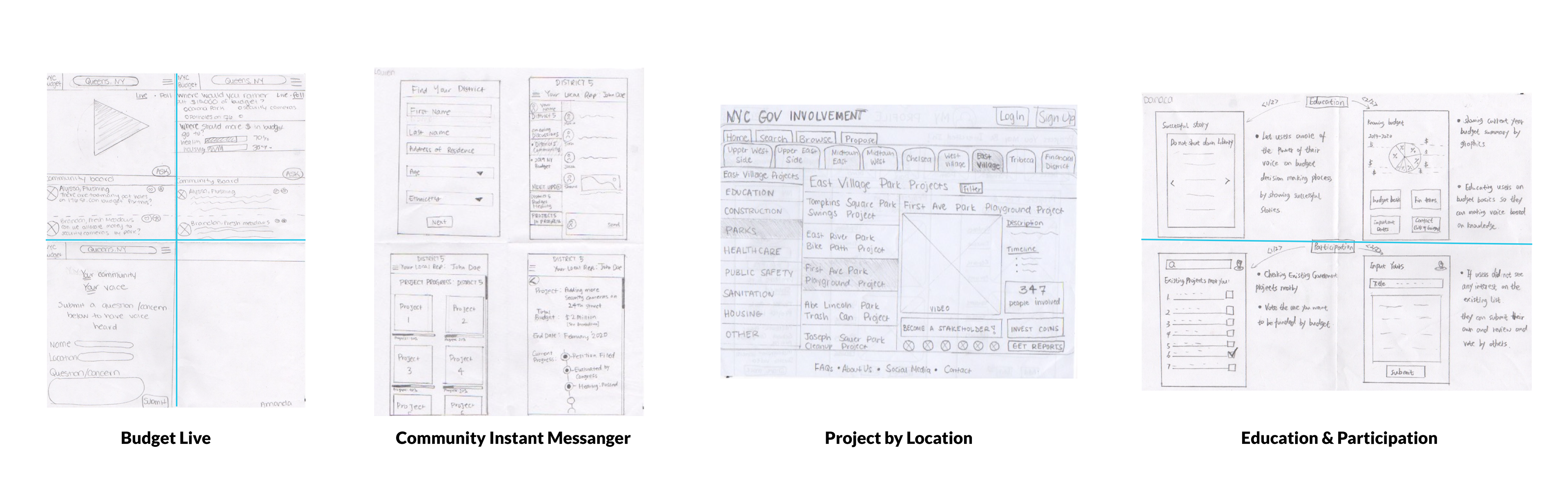
Budget Live
• A mobile app that allows users to tune into their community's budget meeting and watch it live.
• Comments made by other users would pop up below the video.
• An "Ask" button is available for users to click and ask a question to be answered at meeting.
• Polls are available for more engagement from online users.
What users thought:
• Users liked that people can participate no matter where they are.
• Users liked that it allows for easy interaction.
• Confused-if users don't live in that exact district or borough, would they still be able to participate?
• Concerned about people who are just bored and don't take it seriously.
Community Instant Messenger
• A mobile app that allows users to find district channel based on resident address.
• Allows for users to communicate with others in same community.
• View project progress.
• Allows users to view a more detailed view of project.
What users thought:
• Users liked all the project information is in one place.
• Users liked the project timeline.
• Users found the information on representatives useful.
• Users did not like inputting any personal information (age, address, etc.)
• Users did not see how well the local government can monitor these discussions.
Project by Location
• A website that allows users to search for projects by area
• Allows users to view project descriptions and other important information.
• Allows users to become a "stakeholder" or "invest" virtual coins in a project.
• Allows users to focus attention on projects they are most passionate about.
What users thought:
• Users liked the structure of the website.
• Users liked the interactive aspect of the coins.
• Users were overwhelmed by the amount of text on screens. Unclear where to look first.
• Users were confused on what it means to be a stakeholder? What are the coins?
Education & Participation
• A mobile app that educates users on past success stories of people participating in the participatory budget.
•Budget graphics and basic information on NYC budget.
• Allows users to check and vote for existing government projects nearby.
• Allows users to propose new projects.
What users thought:
• Users liked that they can see an overview of what this year's fiscal year budget looks like.
• Users liked that the app provides a good amount of useful information to regular citizens who may not have specialized knowledge into these things.
• Users did not understand the point of success stories.
• What does the voting do? Does it actually make a difference?
New Concept
• Mobile application
• Implement alternative ways for users to suggest projects: videos and pictures.
• Vote for projects directly on application
• Detailed project timeline with milestones.
Wire-framing
We began wire-framing our new mobile application in sketch and built the prototype in Axure.

Usability Testing
In our first round of usability testing we asked our users to:
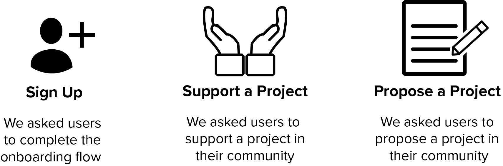
Testing Results:
4 out of our 5 users were able to complete all three tasks easily.
What did users like about our prototype?
Users enjoyed the simplicity of the application. It made it easier for them to get their voice heard on how the government should be spending money.
Questions from our users:
How is the budget related to proposing a project?
What is the difference of me voicing my opinion on this application vs twitter?
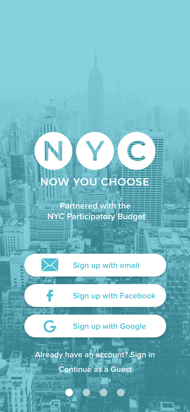
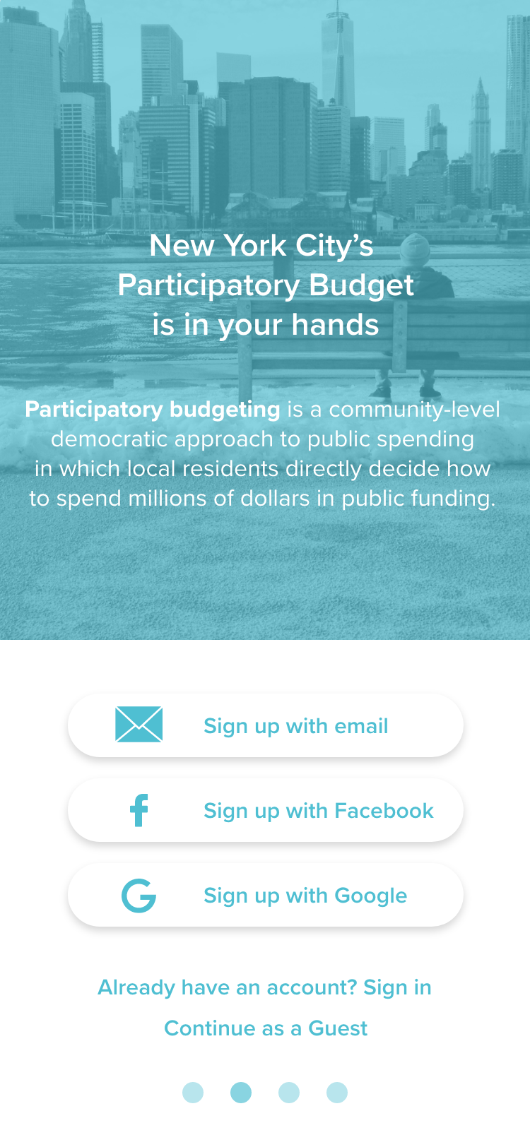
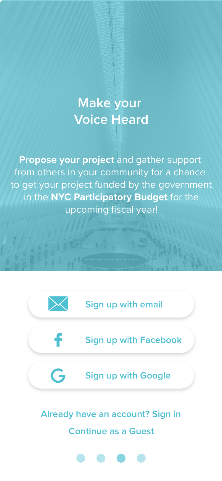
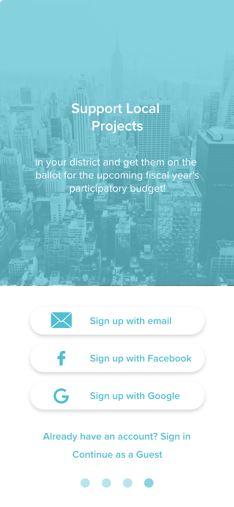
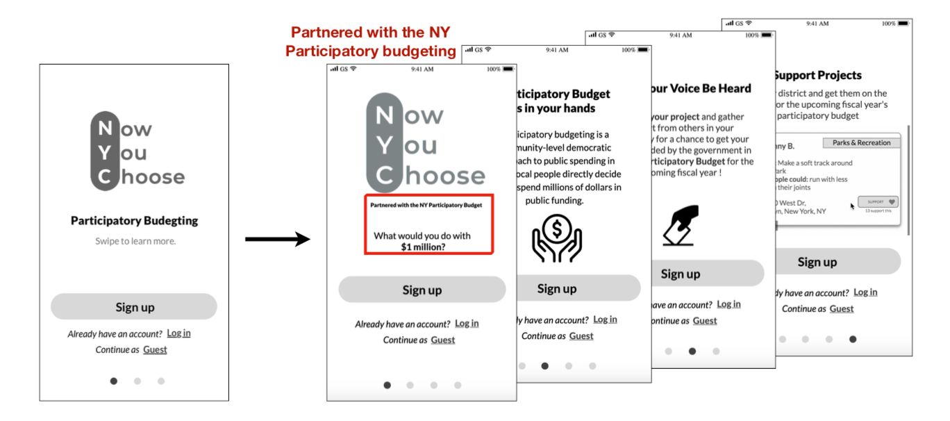
Adding Context
One major change we made was to add more information in the on-boarding flow and clarify concerns that user's had. We addressed our user's concerns on how different it would be than using twitter, we placed text clearly stating that the app was a partnership with the NYC participatory budget.
Our user's had some difficulty understanding what certain content on the page was and overall navigating tools and elements. We addressed this by making our page clearer and adding labels where necessary.

Final Walkthrough
Due to time constraints we were only able to iterate our wireframes and prototype once. Our next steps in this project would be to:
• Conduct further user testing
• Education feature
• Tracking page (new projects, old projects & projects user supports)
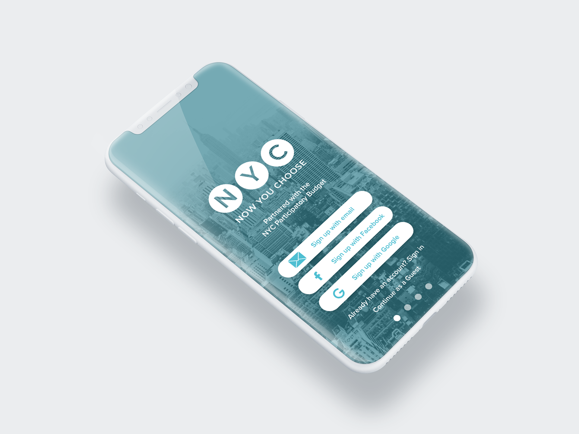
UI Fun
After this project was over I really wanted to bring it to life by adding some UI elements.
For one of my Daily UI challenges I went ahead and made the on-boarding screens in high fidelity.