Creating a tool that helps increase customer satisfaction and sales for RaterBee
RaterBee is a platform that helps managers gather customer feedback in hopes of creating actionable change such as improving customer satisfaction and increasing sales. Our team was tasked to create a user centered interface for managers to view this steady stream of data that would allow them to help to improve customer service and increase sales.
My Role: UX Designer
My Contribution: UX Research, User Interviews, Wire-Framing, Prototyping, High Fidelity Wireframes
Tools: Sketch, Invision, Keynote
Time Frame: 4 weeks
RaterBee is a digital tool that allows retail customers to rate their satisfaction with employees while shopping in store. This gives managers the ability to individualize associate training and coaching to boost sales and customer satisfaction. Our team was tasked to create a user centered interface for managers to view this steady stream of data that would allow them to help ti improve customer service and increase sales.
Understanding the Problem
During our kick off meeting, we learned more about how managers were currently getting the data from their customer's surveys. This data is given to managers in weekly spreadsheets.

The Challenge
Managers were not getting information fast enough in order to make actionable change. Managers need a way to get customer feedback quickly and efficiently so that they can improve customer service and improve sales.
Research
As a team, we worked on domain research so that we could gain an understanding about the industry, how important customer feedback is and how it affects sales.
Domain Research
What we found: U.S. companies lose more than $62 billion annually due to poor customer service. After one negative experience, 51% of customers will never do business with that company again.
What does this tell us? Managers need this information to tackle bad customer service and improve where they can in order to keep loyal customers. If they don't take action on bad customer service the company will suffer.
Competitive Analysis
What we found: We saw other companies who were already established in this industry including: Peakon, Medallia and Honestly.
What we saw: Most of the competitors were using card layouts, charts, top performing employees, and overview cards containing most relevant information

Where can we improve? Based on multiple reviews of our competitors there are definitely areas for that could use improvement.
• Users explained that there are too many features that it was overwhelming and had a large learning curve.
• Users explained they wanted to see a history of customer satisfaction to keep an eye on their employee's improvement.
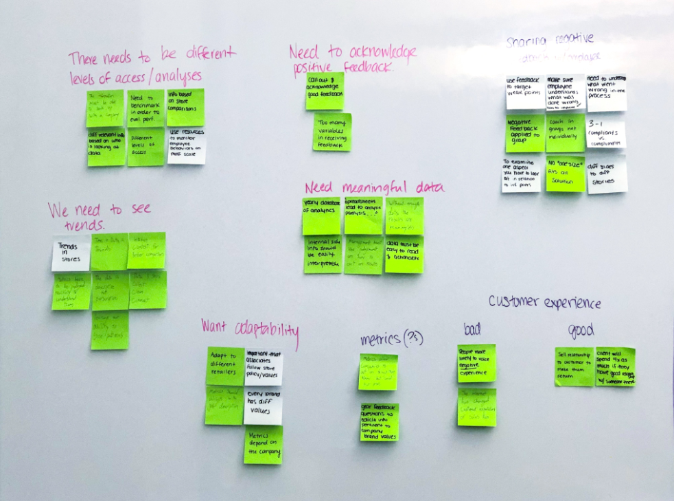
Understanding our user's needs
Our client provided users to interview to get a better sense of what our user's need. However, they were not ideal for our user interviews. These users had previously worked as retail managers but are now working in higher management roles.
We quickly regrouped and updated our interview questions to be more appropriate to upper management roles. This was good for further down the line and to get a sense of what upper management wants to see.
Interview Insights
• Managers focus on the team's improvement
• Coaching focused
• Performance benchmarks matter
• Specific feedback is helpful
• Different levels of management need different levels of information.
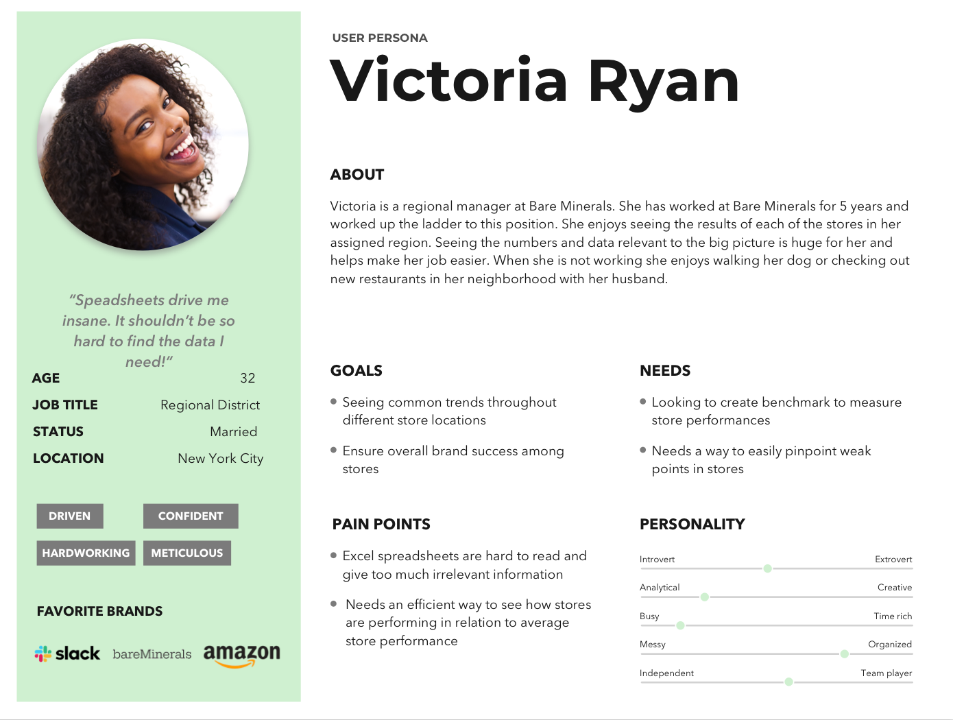
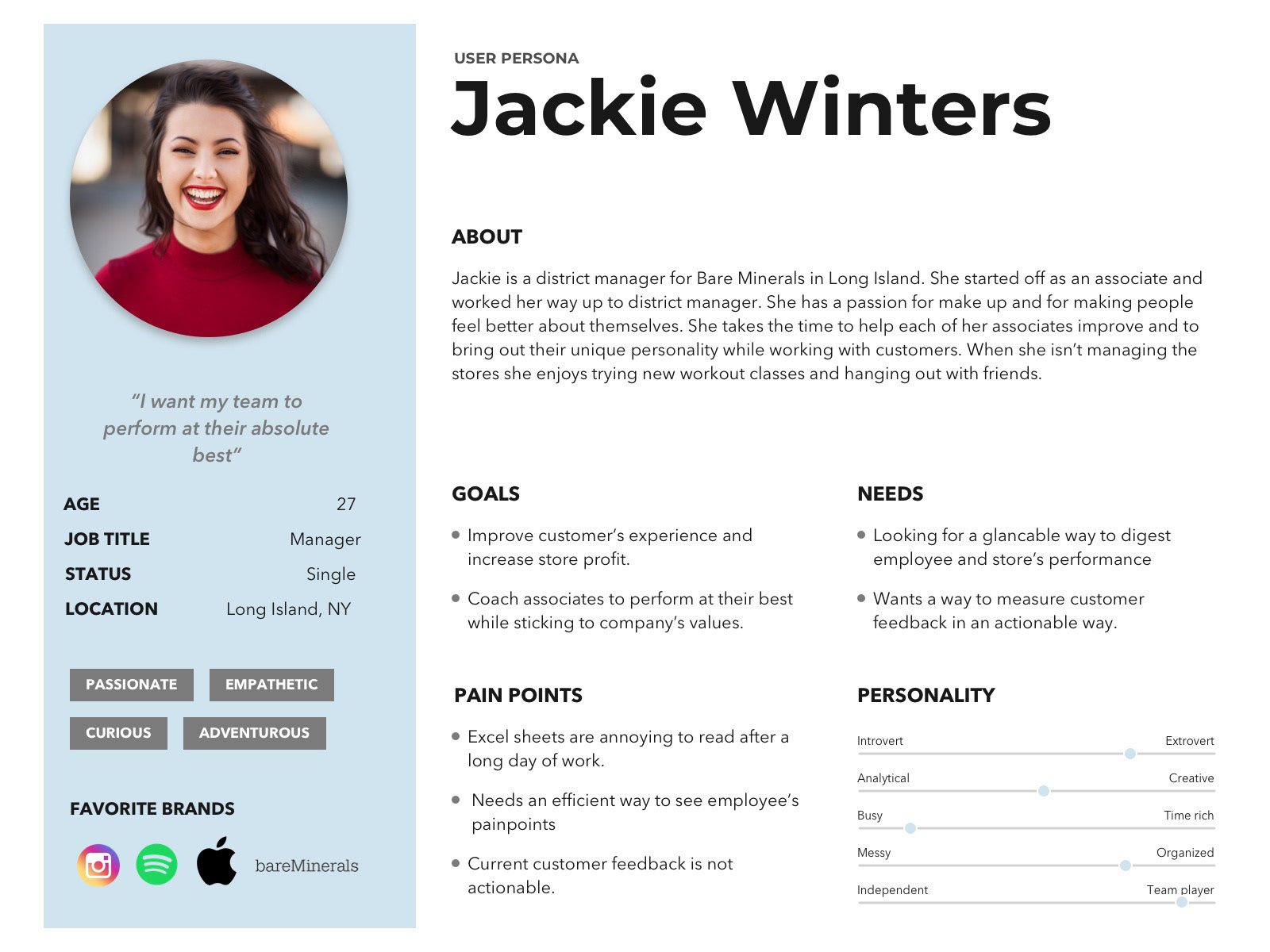
Developing Personas
After conducting our interviews I created two personas based on user interviews and research, I identified two main user groups. I built personas to refer back to while we focused on finding a solution
Click to expand
Ideation Phase
As a team we decided to time-box ourselves for 10 minutes to develop concepts for our solution. Once we started the ideation phase I had a tough time trying to break away from the standard dashboard layout we had seen while conducting domain research and competitive analysis. However, after a few rounds of concept design and talking with my team we decided to focus on more of the features we would implement in our solution.
What was challenging: Our client seemed to already know what he wanted the solution to be- a dashboard. I developed features that would be displayed on the Today page and elements that a manager would use throughout the day. I focused on adding a team element that would show who is working on that day/shift.
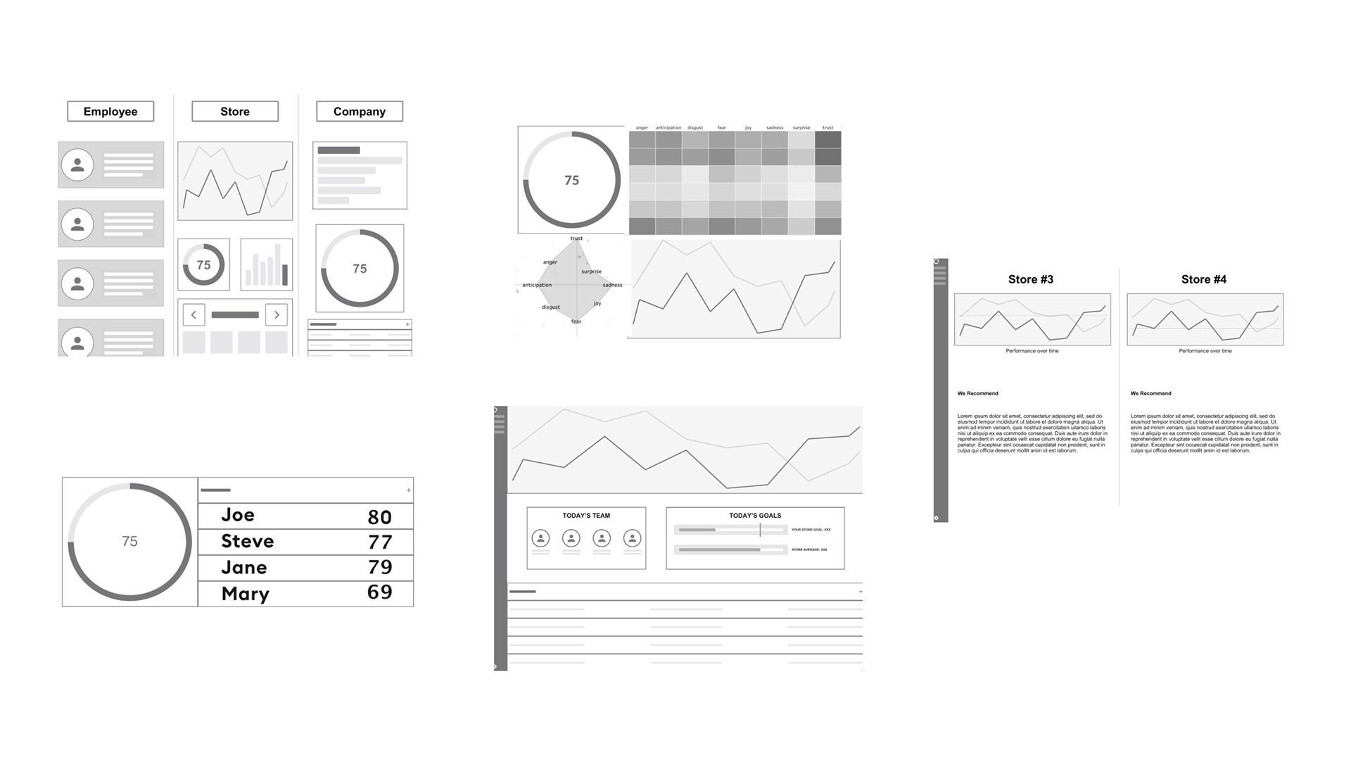
Final Deliverable
My team and I handed off our wireframes and I created our prototype in Invision for the 5 main pages: Overview, Today, Compare, Feedback and Employee page.
Due to time constraints we did not have time to create hi fidelity mock ups. After the project I went ahead and worked on the files to create a hig h fidelity prototype.
Feel free to click through my high fidelity prototype here.
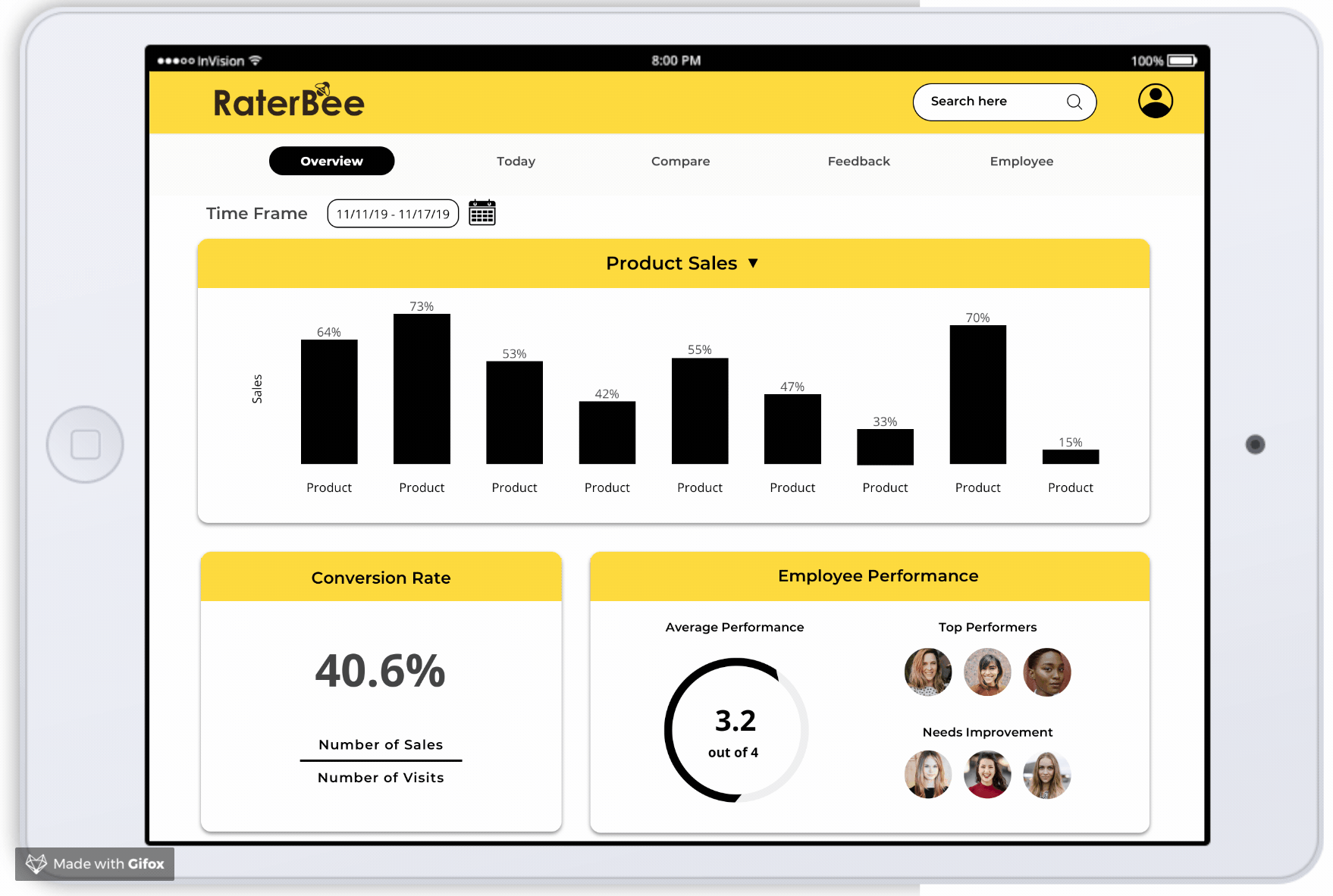
Overview Page
This overview page was made to help managers to see a full glance of what is going on with the store. This also allows for our two personas to be able to see the information they want and nothing else that would be distracting. This was formatted in a way that would be quick and easy to read for our users.
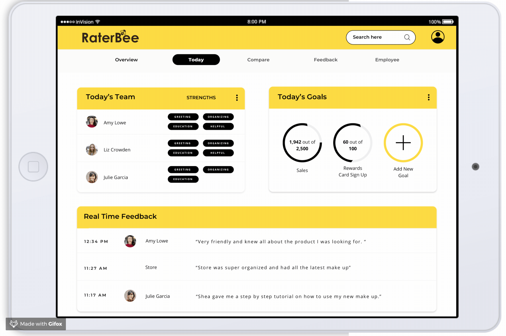
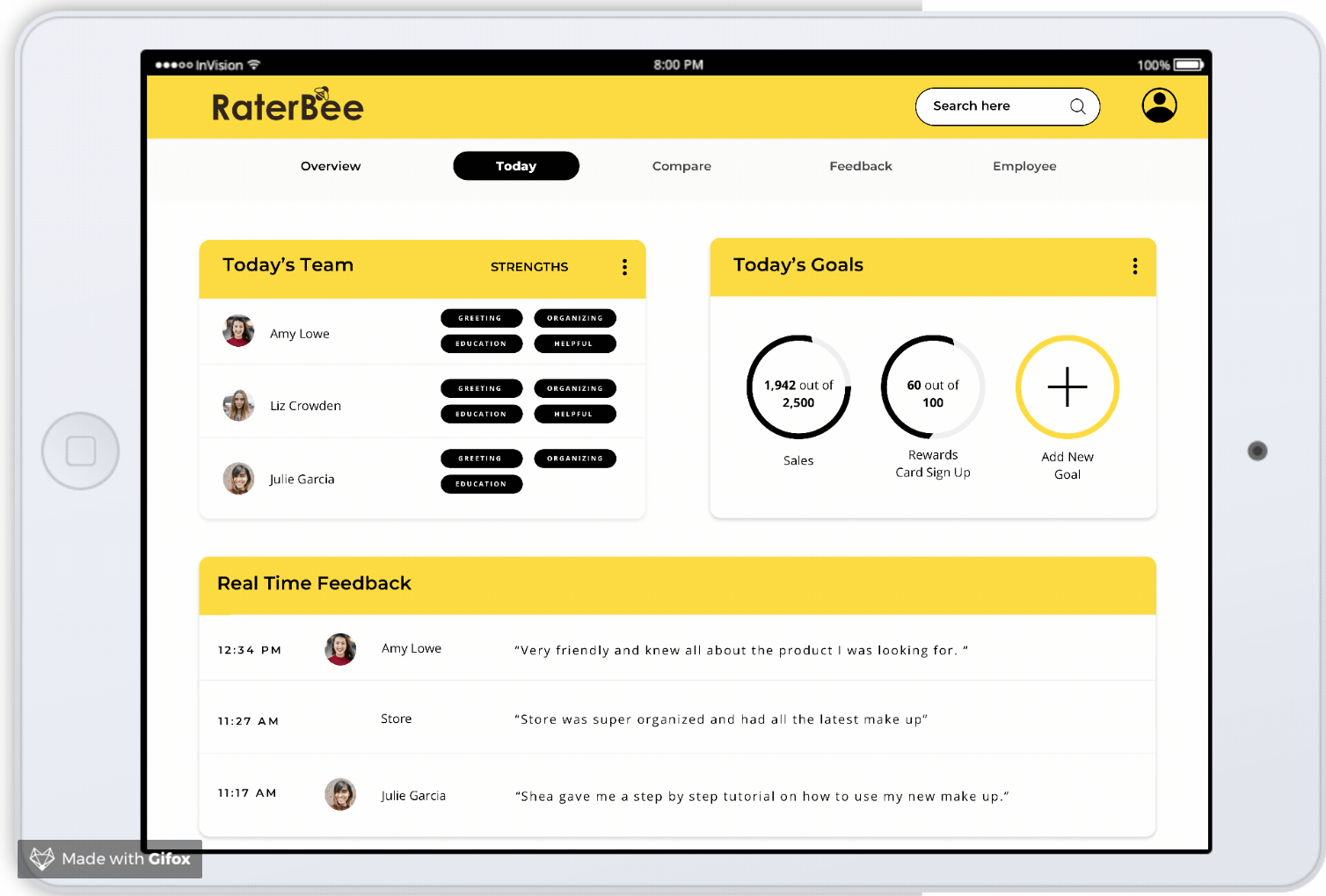
Today Page
I focused on the today page. In the first version of the today page it displayed four sections: Today's Team, Today's Goals, Real Time Feedback and News & Promos. Using what I learned in our competitive analysis, I formatted this in a card layout with minimal visuals to make for less distraction.
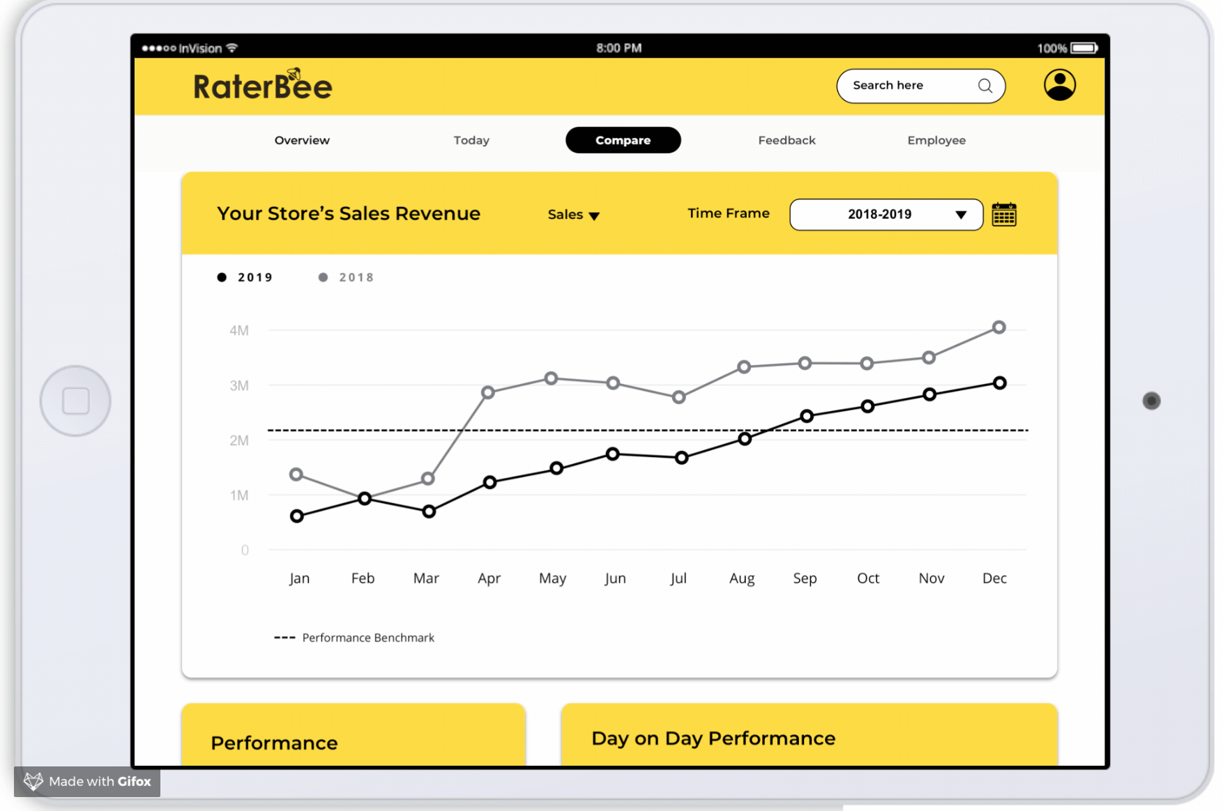
Comparison Page
This concept was created in response to what users said in terms of being able to benchmark and compare sales. This concept would use numbers and graphs to allow users to compare data between their stores and benchmarks set by the company.
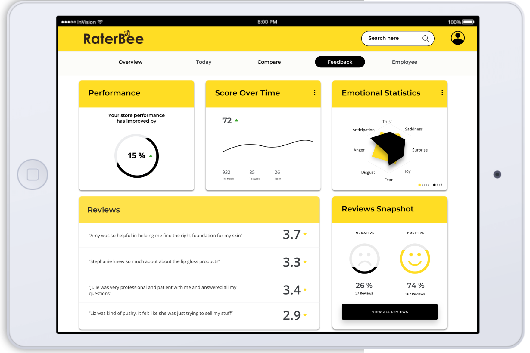
Feedback Page
This page was created in order for managers to be able to get a sense of where to improve based on customer reviews. Snapshots and easy visuals allow for managers to skim rather than read full reviews.
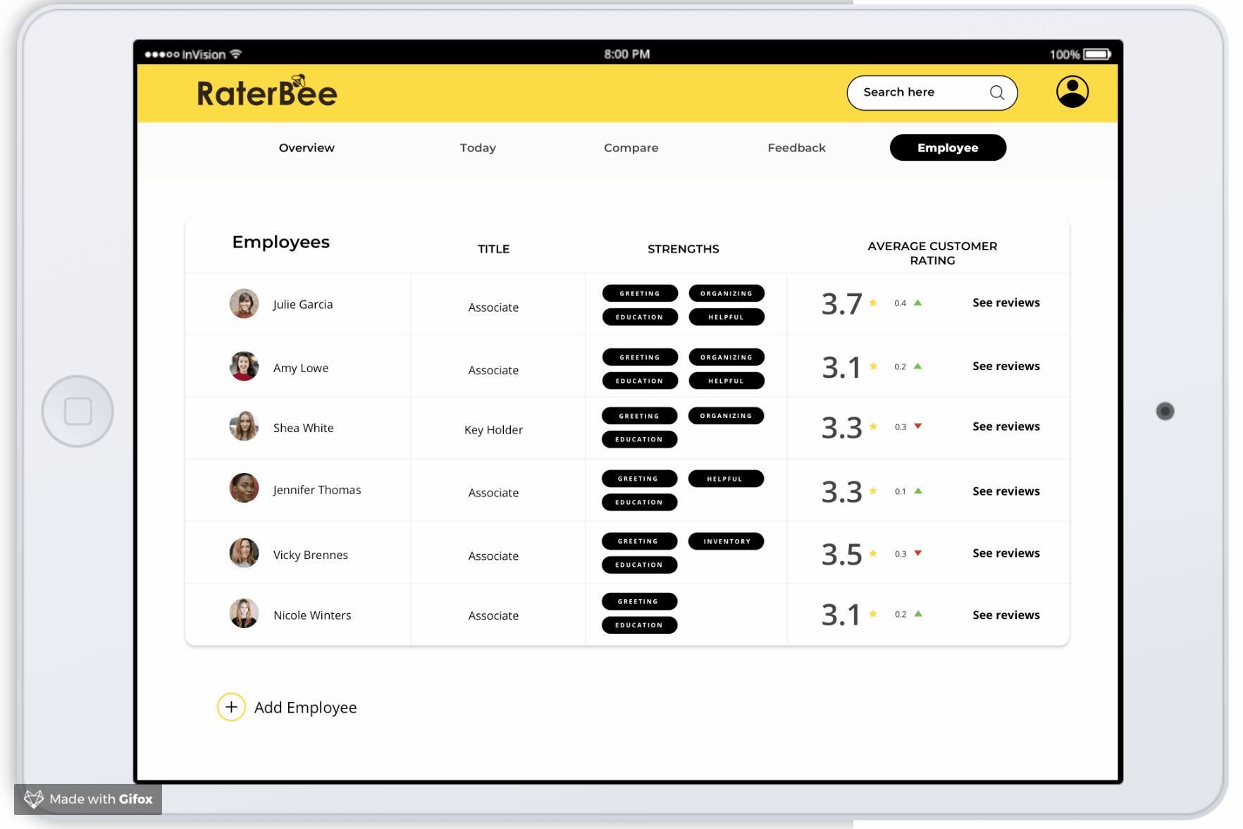
Employee Page
While I was testing the Today page, I also received feedback that users wanted to see more information on their employees and their specific feedback, strengths and other details. After talking with the team to see how we could implement this in the solution I created an Employee page.
This employee page is accessible from the top navigation and breaks down each employee with their specific customer feedback data and general information.
Next Steps
Due to time constraints we were only able to iterate our wireframes and prototype once. Our next steps in this project would be to:
• Test our updated prototype with the appropriate users.
• Add an archive of goals so users can see their goal history.
• Integrate social media with the sentiment analyzer page.